Article
Never Forget the Packaging: Create an Experience Not Just a Website
Websites contain endless interaction possibilities that create a unique set of user experiences – but without some sort of guidance or direction, this can be a frustrating experience. INN8’s Digital Front-End Product Owner Shanaaz Singh explains just how important UX is, no matter the size of your website.
6 min read

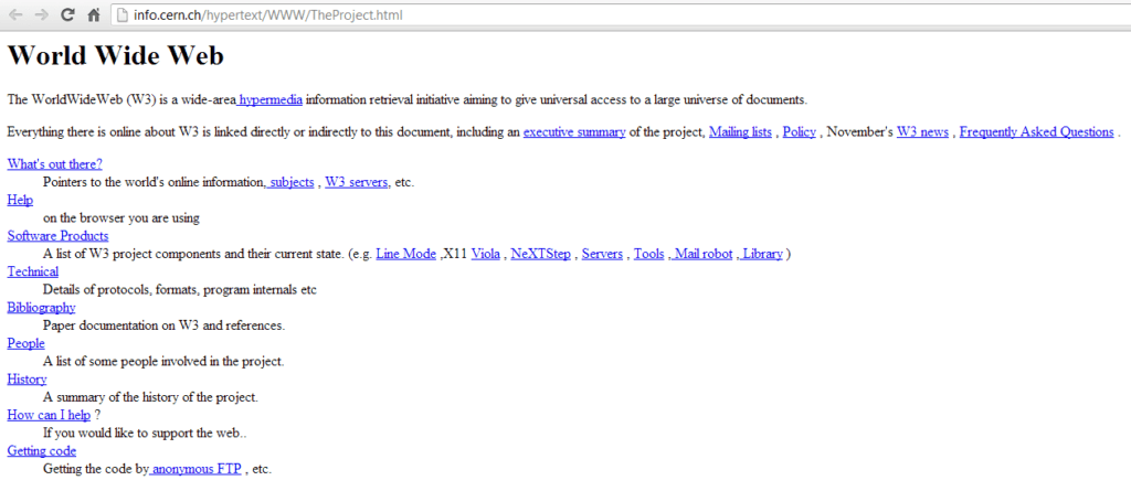
Early websites were simple and offered limited functionality. In fact, the first website in the world explained what the World Wide Web is and how it can be used.
That was the 1990s.
Fast forward thirty years and we are now presented with a universe of websites which each contain endless interaction possibilities that create a unique set of user experiences. Functionality on websites has broadened greatly over the years, becoming integrated into the everyday lives of users and providing them with a place to shop, stream media, and express opinions – the modern-day soapbox.
As with most evolutions, the www era has seen the emergence of new words. For example, the word “webinar” was officially recognised in December 2008 when it was committed to the Oxford English Dictionary. This word now describes the use of a website to conduct seminars, i.e. web + seminar = webinar.
Users now need to wade through this plethora of websites and try to meet their needs. Without some sort of guidance or direction, this can result in a time-consuming and frustrating exercise. That is why websites can no longer be considered a one-size-fits-all solution. The development of a website requires an in-depth understanding of the user wishing to interact with it: What are they wanting to achieve? What problem are they wanting to solve? What sort of emotions, thinking and actions would aid in their decision-making?
It’s all about the UX
The term user experience (UX), very simply, means just that: the experience a user goes through when interacting with a system, product, or service. In a broader sense, the concept of UX design takes into account the many aspects which could influence the way a user experiences an interaction. Some of these aspects include aesthetics, information architecture, interface design, usability, and user needs. All of these aspects combined can aid in delivering a fulfilling user experience.
In following with the “simple” view of UX, the emphasis is on the user and understanding their thoughts, emotions, and behaviours. Designing with your user in mind requires a comprehensive understanding of these psychological concepts. The field of psychology provides UX designers with principles and theories that can be used to better understand users.
Businesses can no longer create a website that suits only their needs and purposes, as this will likely not align with the user’s needs and objectives. This has presented businesses with a new conundrum: How do I present my website in the best possible way to the end user in order to support what it is that they are trying to achieve?
Humans can be fickle. If they perceive that any discomfort during the use of a website outweighs the benefit that they are trying to achieve then they will go elsewhere. This has led to a mutually beneficial relationship: The user doesn’t want to be wasting time trolling through endless web pages in order to achieve what they want, while businesses want to ensure that users follow through to purchase their product or keep making use of their services.
Knowing how to apply cognitive, behavioural, and social psychological principles can lead to an enhanced user experience while also supporting the business objectives and goals.
Less really is more
The “less is more” concept is not only reserved for people that wear make-up and want to avoid looking like a Batman villain.
Studies have shown that the more options that are presented to a person, the longer it takes them to make a decision. This principle is known as Hick’s law. It takes into account the number of options presented to an individual and how that affects the speed at which they can then make a decision. The more options there are, the more difficult and time-consuming the decision-making process becomes.
Bearing this in mind can aid in reducing the time it takes for a user to make a decision. This can be seen in many of the menu structures today. Options are grouped at various levels which guides the user’s selection process. Menus start out with a broad category: In the image below, make-up is a broad category and the options within it become a little more specific as the user moves through their decision-making process until they eventually get to where they need to be.

Memory games
Do you remember what you had for breakfast? Or, why you needed to walk to the kitchen? Where was I going with this? Oh yes!
Human memory capacity is limited. Short-term memory is especially limited and can only maintain around four chunks of information at any one time. Also, humans tend to better recall the first and last items which are presented to them, known as the Serial Position Effect.
In design, this becomes important as one wants to limit the memory load placed on users. This can be done by contextualising important aspects of a web page so that there is no need to remember and recall what has been done, or, where you are – like, what search or filter has been applied or where in the menu structure you find yourself.

The concept of the serial position can particularly be seen when making online purchases. It’s the process that guides the user from point A to point B so that they are always aware of where in the process they are without the need to think about or recall what they have done or think about what they need to do. The order of the actions can also be directed by this as more important items can be placed first and last to assist in better recall.
Online mental modelling
Humans look at the real world and internally form thoughts, beliefs, and opinions. These are supported by past experiences and situations. All of this information is processed, which then determines how the person responds to the current situation they find themselves in. This is referred to as mental modelling and helps humans to simplify and understand the world around them.
Thirty years of www experience is certainly enough time for people to have formed mental models of how they interact with websites. They have started to build beliefs and expectations of what certain things mean or do. One of the most obvious examples is the icon for a magnifying glass which is now synonymous with the search function on a website. The expectation is that – based on previous interactions on other websites – when the user clicks on the magnifying glass, they are able to type in search criteria and get results related to that.
Another example is the # sign. This has taken on yet another meaning with the onset of social media #truestory #octothorpe #userfirst #userexperience #onlinementalmodels
Colour therapy
Colour has been used for centuries in the art world to convey emotions and aesthetics. It has since evolved and become a field of study in itself. Particularly, the study of the effect of colour on human emotion, the mind, and human responses.
These studies have revealed that, for example, red is a colour of action and creates a sense of urgency in people. This is why many sales signs appear in red – or why it’s used to mark danger or items of a serious nature: Are you sure you want to delete this file?
In this way, colour can affect how your users feel and behave when interacting with a website.


These are but a few concepts from cognitive, behavioural, and social psychology that can aid in design considerations for a website. Drawing from this can help to understand users better and thereby ensure that the web page delivered meets their needs or solves their problems while still creating a pleasurable experience.
“It is not enough that we build products that function, that are understandable and usable, we also need to build products that bring joy and excitement, pleasure and fun, and, yes, beauty to people’s lives.”
— Don Norman, author The Design of Everyday Things
Written by

Shanaaz Hendricks
Shanaaz’s experience since 2008 as a business analyst has provided her the opportunity to explore the many facets of a business. Upon joining INN8 in 2017, she was drawn to the digital experiences our platform offers. Now, as the Digital Front-End Product Owner, she is able to focus on understanding people and how they relate to the world around them and, in turn, apply this to the creation and innovation of the digital experiences offered to our advisers and ultimately the clients they service.